The Best of Under Armour Built Around You
The Under Armour app was built from the ground up to deliver a world class experience for a growing mobile audience. In parallel the product created a space for the business to test and optimize personalization strategies.
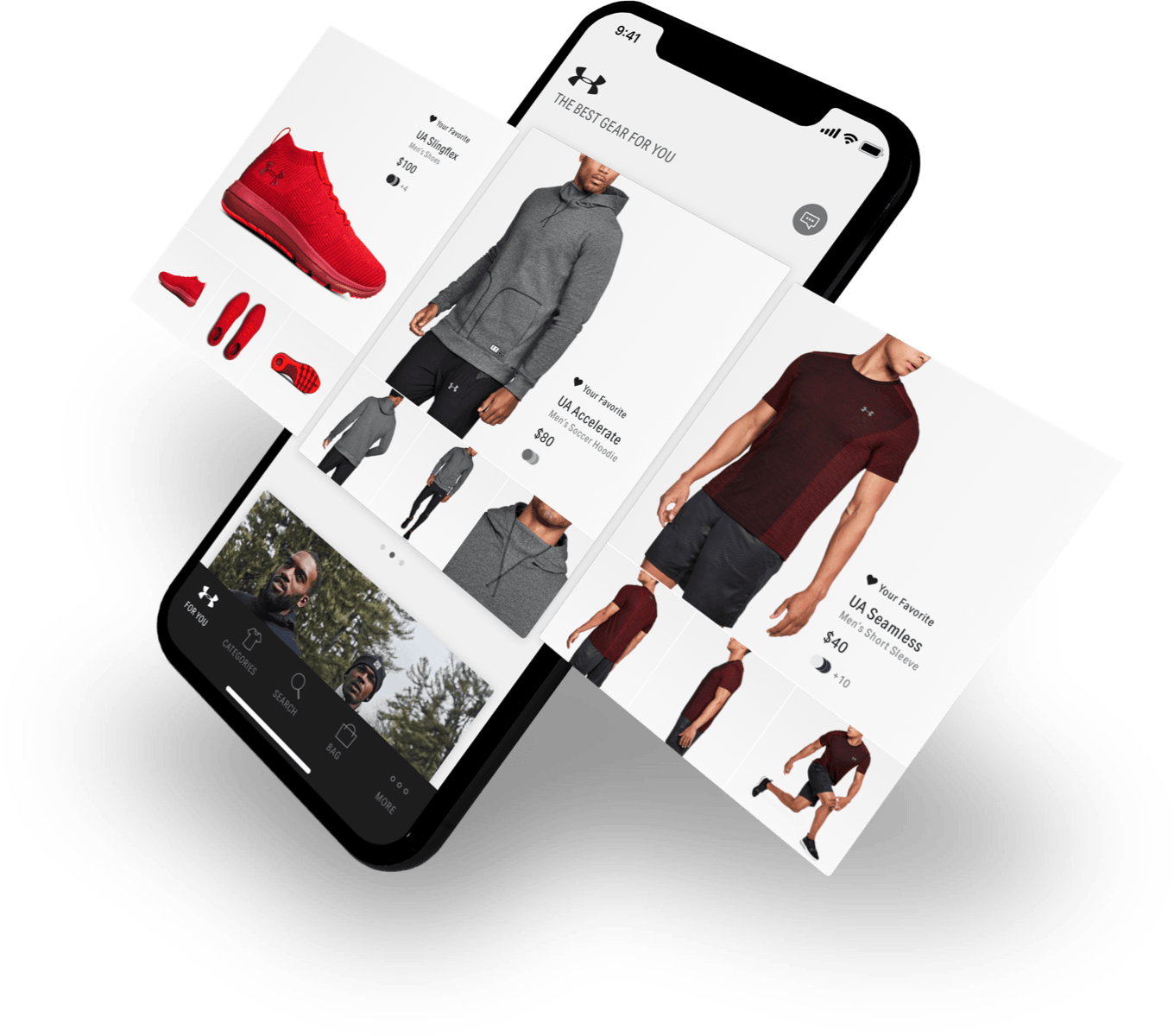
The Under Armour app gets you moving fast with instant recommendations of stylish products tailored to your favorite sports and activities. Gorgeous photography’s a given, but the app's design is really the all-star—it makes it so easy to find new gear.
—Apple App Store Editors’ Notes
Objective & Role
Leading up to 2015 Under Armour was experiencing an increase in mobile web traffic. Our objective was to quickly establish a native, world class iOS and Android experience for this growing audience. In 2015, I joined the Direct-to-Consumer team as the first individual contributor. Initially I facilitated, guided, and inspired multiple design and development agencies to bring the product to market. After the launch I had the opportunity to help build out a high functioning and cross-disciplinary internal team to maintain and refine the product.
Establishing the Baseline
The initial timeline was tight so we leveraged existing research, personas and mobile web data to define our approach. We established three key tenets to guide our decisions as we built a scalable baseline for the product.
Personalize
Guide the user to the right product for their needs.
Progressive
Provide just enough information for the user to make the decision at hand.
Optimize
Elevate the best path for the user to take when on mobile.
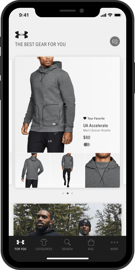
For You Feed
A place for personalized content and recommendations.
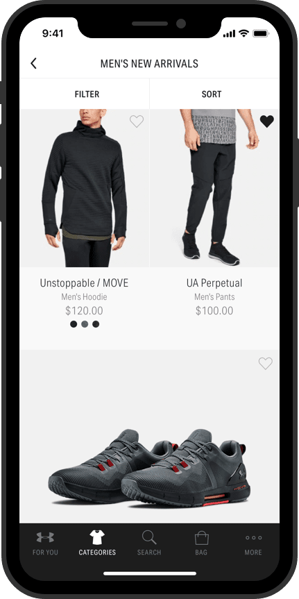
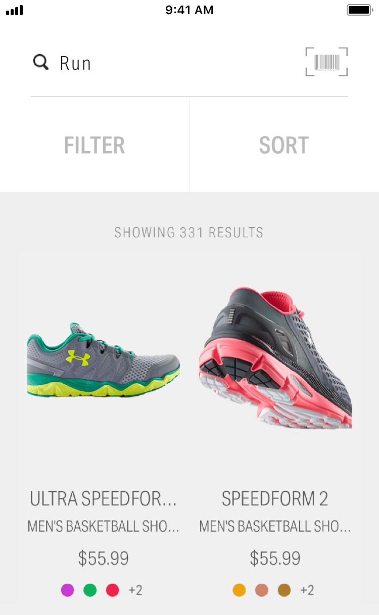
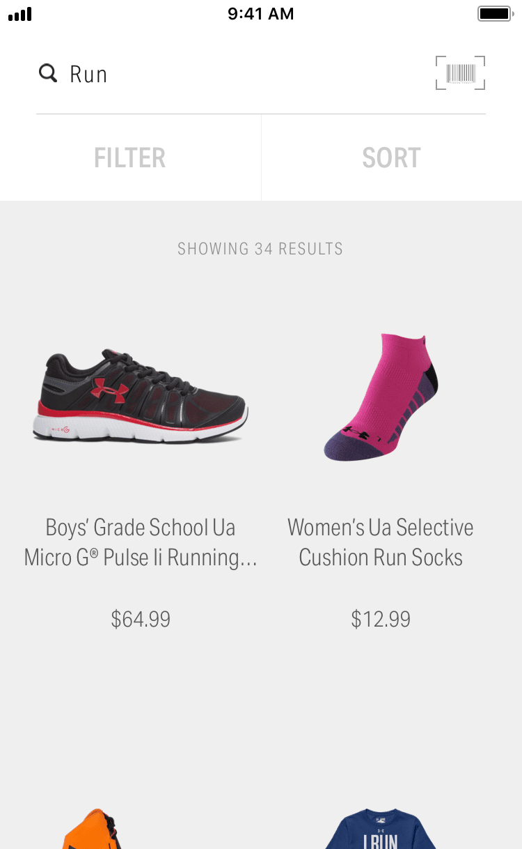
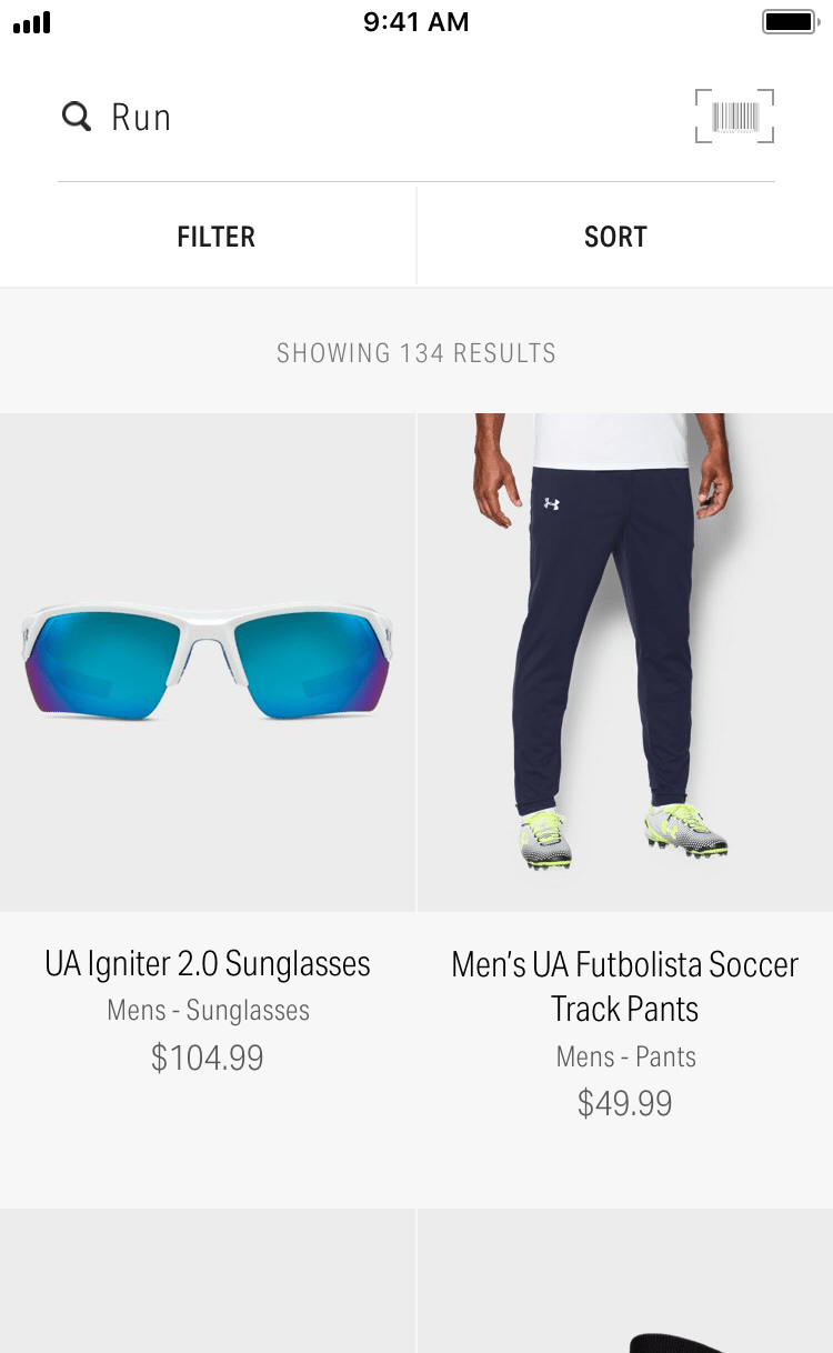
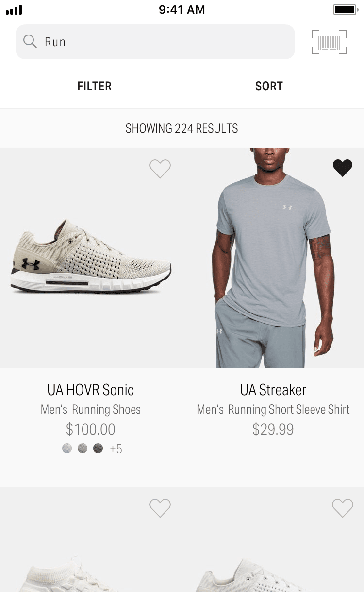
Product Grid
Leverages rhythm to highlight and inject energy into the experience.
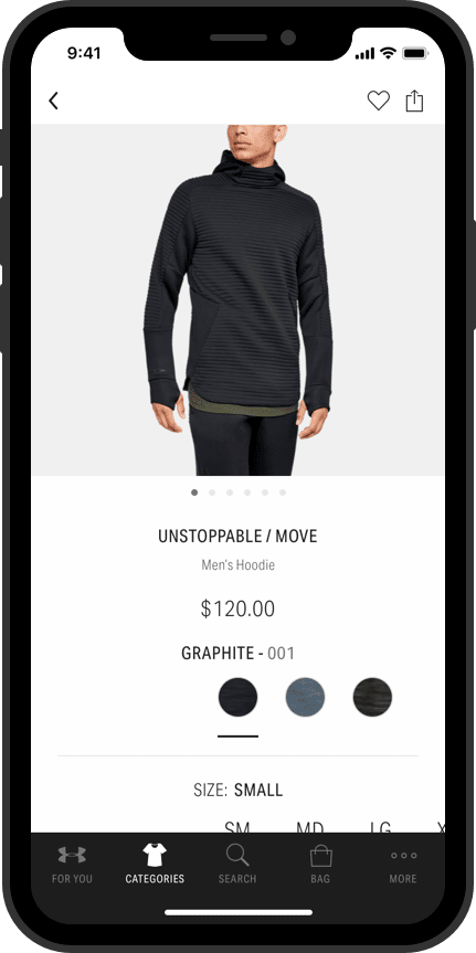
Product Details
Elaborates on and guides the user through the available options.
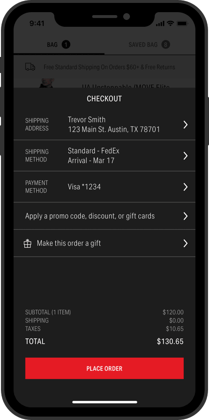
Checkout
Focuses and optimizes the process for mobile.
Listen to The Users
As the baseline functionality launched the team monitored app reviews and product analytics. This observation period helped the team identify our blindspots and align on the best research methodologies to bring more light to these blindspots. One initial focus area was understanding the users’ different needs when in a browse vs. purchase mindset.

Behavioral Framework
From this initial research, combined with secondary research, we established a behavioral framework. This framework became a tool for the team to evaluate features and understand when and why different Under Armour channels may converge or diverge on an approach.
-
Product Focused
- The goal is speed
- Know exactly what they want
- Clear product identification
- Effective search
- Previous purchases
- Streamlined checkout
-
Browser
- Leisurely shopper
- Wants to see what has changed
- New, Popular, Sale
- Recommendations
- Sharing
-
Researcher
- Collecting information
- Trust is key
- Consistent information
- User Reviews
- Comparison
- Flag items of interest
-
Bargain Hunter
- Best deal possible
- Sales & discounts
- Associated discounts
- Savings at checkout
-
One-Time Shopper
- One-time need
- Unfamiliarized
- No account
- Clear navigation
- Comprehensive descriptions
- Trustworthiness
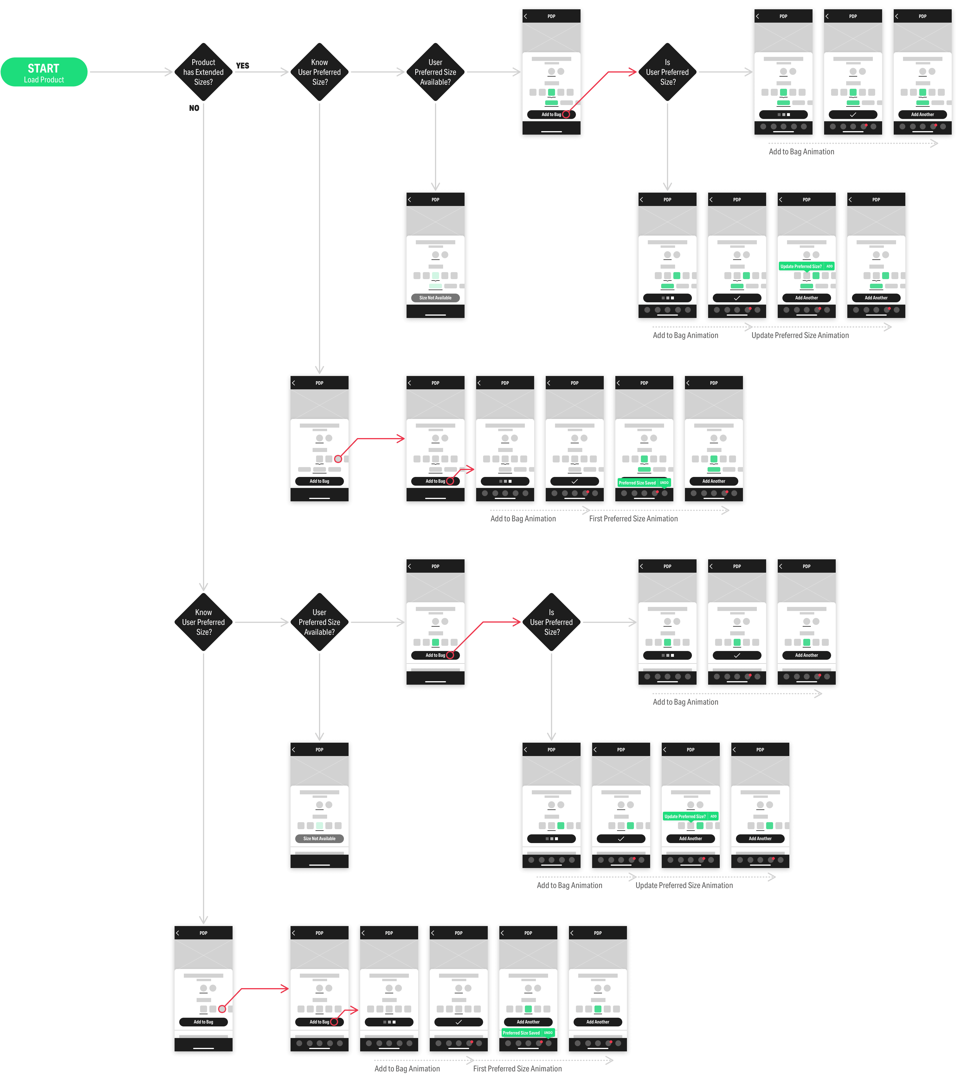
Test & Iterate
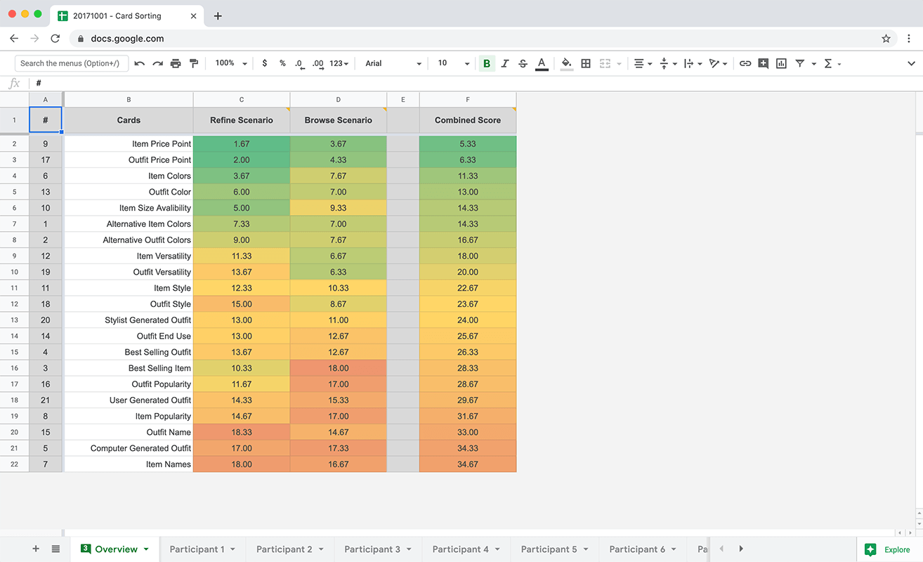
I’m a strong advocate of prototyping and testing new interactions with real data. From our research we identified the opportunity to improve the size selection functionality. The initial size selection functionality did not fulfill our key tenets nor our users needs. After stakeholder interviews and a team brainstorm session I pulled together three prototypes powered by real data. The prototypes were tested with users to understand their mental model and the best path forward for this functionality.

Variant A
A more advanced interaction model allowed users to select any available size & length from either selector.

Variant B
A more traditional interaction model allowed users to select length first then see available sizes.

Variant C
An inversion of variant B allowed users to select size first then see available lengths.
Findings
1
Users' mental models consistently aligned with Variant C with length as a secondary option of size.
2
Users had different expectations for the short & tall options. This was resolved with the addition of the “+/-2in Length” in later testing.
3
Users were receptive to the app saving their size. Particularly as size options become multifaceted.
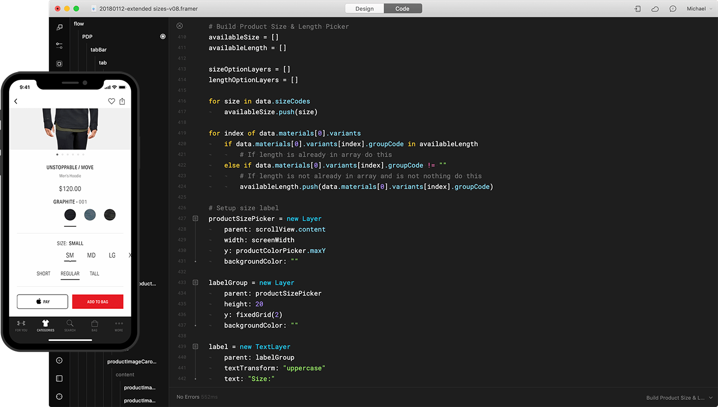
Implementation
With a clear direction forward the cross-disciplinary team came back together to develop a phased project plan. At this stage design plays a pivotal role as a facilitator making sure everyone's voice is heard and accurately represented. Clear visual documentation is vital for alignment and understanding of what the user's experience will be at each phase of the project release.

Product Progress
Over the years this agile and collaborative approach has empowered the team to fluidly build on the baseline product as the team, business, and user needs and expectations shift. This progressive and achievable improvement can be seen in every corner of the app.
2015
The original proof-of-concept pitched by the external agency.
2016
Design refinement from user feedback and the development process.
- Mobile Optimizations
2017
Enhanced accessibility and design consistency.
- Accessibility
- Product Clarity
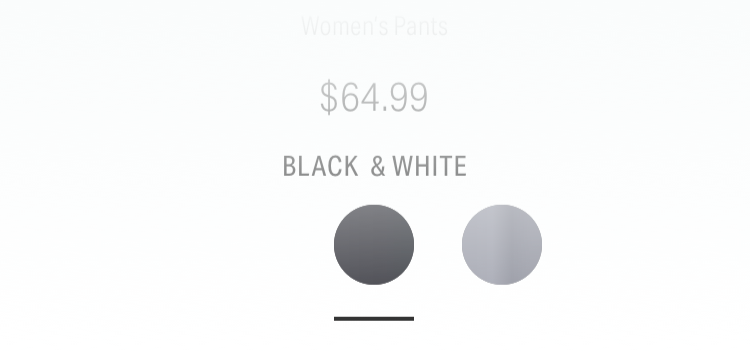
2018
Empower browsing & researching behaviors.
- Product Favoriting
- Additional Colors
- Alternative Images
Impact
Launching the apps, building out an in-house team, and pushing the product forward over the years has demonstrated the potential and opportunities for teammates, the business, and the users.
Editors' Choice
In 2015 the Under Armour app received the Apple Editors' Choice recognition.
App Rating
The iOS (4.8) and Android (4.7) apps have consistently maintained high App Store ratings since launch.
Conversion
The apps continuously deliver the highest conversion & order size of all Under Armour direct-to-consumer channels.